A Practical Experience
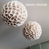
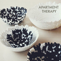
/Ring Of Roses by Clare Elsaesser
As an interior design student, I got to play artist at my dream job for a few months, working as a visual display intern for Anthropologie. It was an inspiring, rather humbling experience. I was mentored by a Senior Display Coordinator, Asaki, who's weekly undertaking put into perspective the small scale at which I design for this blog. In order to be successful in this position you need such a wide range of of skills, from fine arts to soft construction, you need to really understand the brand, and you need to be able to see the big picture, all from a cramped art room. Here are my design takeaways from interning with Anthro...
1. Make a sketch.
This was the first thing I had to do on day one. My task was to build a series of 3D baubles to be installed from the ceiling in the entry of the store. I learned how to make scaled sketches in school, but it is really straight forward, simply use a scale (1/2" = 1' works well for smaller interior spaces)something you can do with a standard ruler. The benefit of sketching is that you will know exactly how a piece will fit into the whole. This is especially important for room layout and hanging art.
2. Composition makes or breaks a design.
Finding the right balance of color, negative space, light, and mass (some of the elements and principals of design)can determine whether or not a design succeeds. Asaki understands composition. Her current backdrop in the main window is a foggy scene of the Marin Headlands, with the Golden Gate Bridge peaking through, and 3 dimensional hot air balloons hanging in the sky. This could have easily gone the direction of a child's room, but the execution feels dream-like and impressionistic.
3. Craftsmanship is crucial.
Anyone can follow a tutorial to make the pieces that you see in Anthropologie...a coral reef wall, a bent wood swirl sculptures, a sea of fish, a forest of mushrooms. The difference between the artful Anthropologie version and a home craft experiment gone awry is in execution. They make things out of paper, wire, cardboard, and canvas, they spray paint and hot glue, just like we do at home. Even on a small scale, a design can work if it is done with some precision. This precision comes with practice, trial and error, and by using proper technique. I had to educate myself on how to apply gold leaf in an "organic way" to create patina, and how to score chipboard enough to easily fold it without splitting or looking sloppy, I used a common level to hang 100+ ornaments on the same linear plane over a table of kitchenware. Taking time to learn how to do something well before building or displaying a piece ensures the right end result. At Anthropologie this end result is both refined and unconventional.
4. The psychology of color.
I love color, and I think I have a pretty good understanding of color theory. The use of color depends on the size and scale of a space, and with the mood that you are trying to convey. Going back to the hot air balloon window example, Using muted tones of grays, blues, and greens, with a healthy dose of white made the rust and orange of the bridge pop from the fog. The bridge feels hopeful, and the headlands seem calm. Translate this idea to a room, and you have a perfect retreat.
5.The essential power tools.
Going into this internship I wanted to learn one thing above all, and that was how to use a variety of power tools. I think there is certain apprehension on the part of a lot of women to pick up a circular saw and cut a piece of wood. It's not something that I learned how to do growing up. I find using power tools, well, kind of empowering. I can chop and saw, drill, wire a lamp, use an air compressor. I've learned to make things sturdy, and precise, as well as pretty; the most useful takeaway from the whole experience, and one that will translate in to my work going forward.


